Appendix 1: Expanding experience
A1.1 User interface concepts
Following on from the experience prototype tests, where some lessons could be brought to bear, the following studies were created to see how some of the core concepts considered for inclusion would work within an operational environment of an iPhone 6.
It is not anticipated that a native application is necessary at this time, but the examples below in the most case could easily be web applications accessed through a browser.
Both examples use a similar user interface colour palette as an nascent direction, but each display information and situate the user in a completely different manner. In some respect the first user interface proposal may prove to be more successful for a wider variety of users. In the other example, the UI proposal may allow for a more modular rollout of functions as they are included with Prepare Wellington’s suite of abilities.
Note that these two proposals also start to communicate how similar experiences could complement one another in a ‘degraded’ user experience.
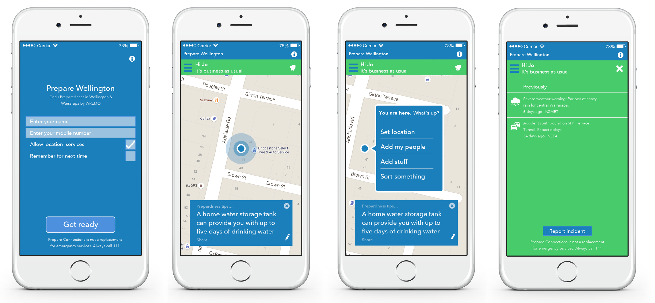
A UI that degrades gracefully is one that can respond, not only to the type of screen it appears on, but also the quality of data that has been revealed. In this case the map doesn’t display due to it not having been downloaded/cached prior, or due to a current lack of signal.
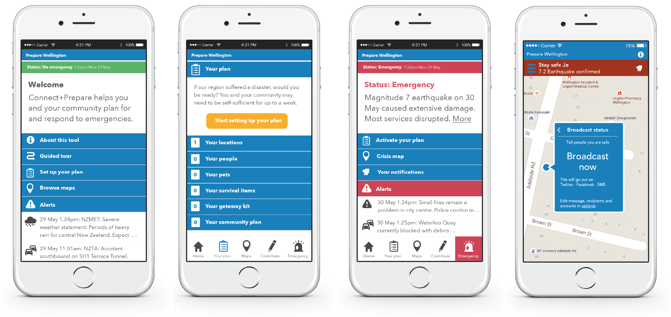
A1.1.1 Trunk and branch navigation
An examination that brings to light some of the opportunities around the integration of the “Preparedness kit” into a flow that allows the user to complete it incrementally at their leisure or perhaps in relation to known locations.
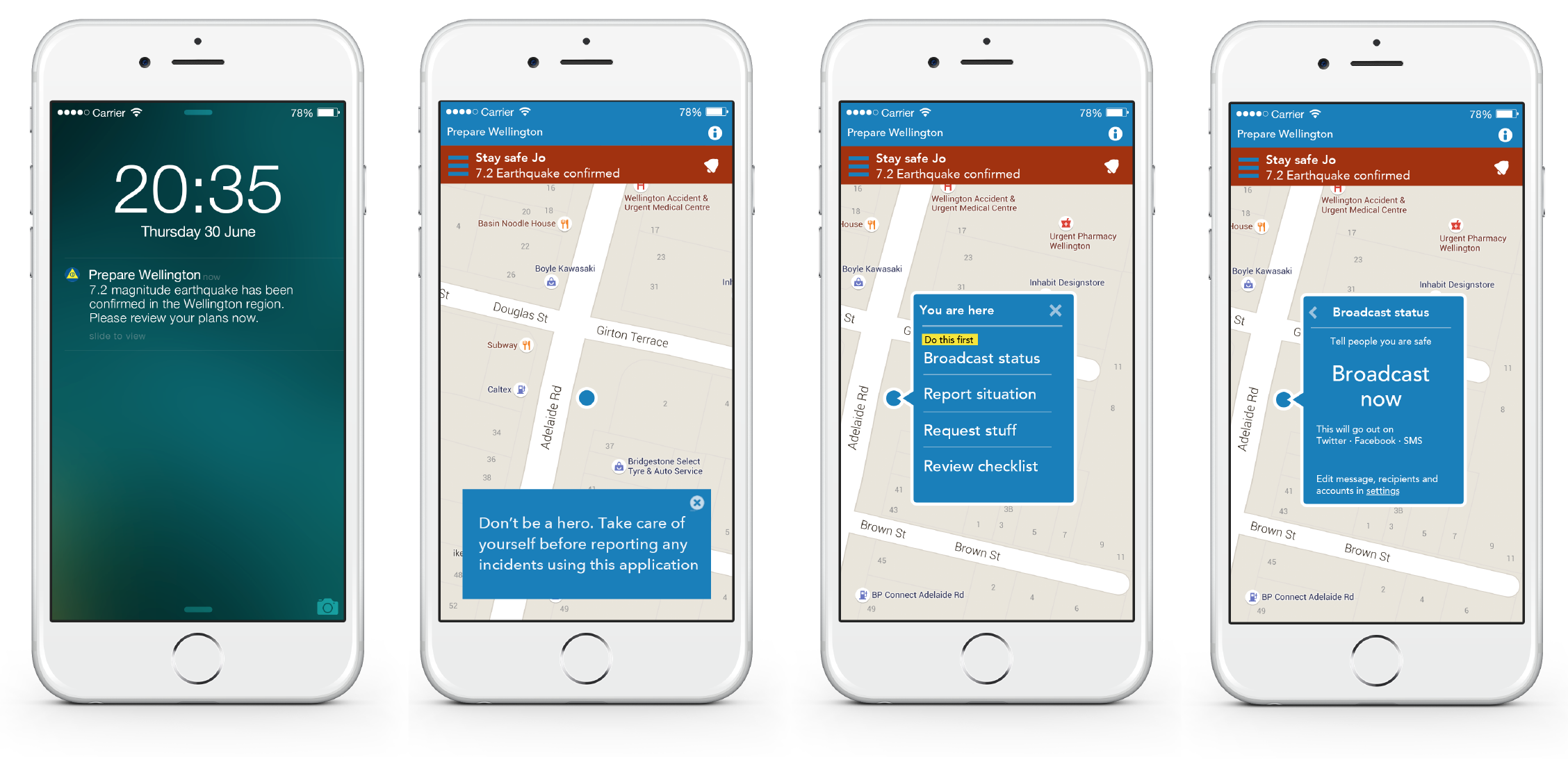
A1.1.2 Contextual navigation
With the experience design concept proposed at the wireframe level and tested (§7.2), this work in the visual design level includes some of the discoveries and observations.
“Business as usual” — Onboarding
Post-crisis confirmation — “Status broadcast”