UX/UI
As a basis for testing, each step in the above user journeys are transformed into wireframes: each an illustration of an interface that enables the user to complete the task as may be required in each scenario.
7.1 Experience prototypes
Like blueprints for architects, ‘wireframes’ are sketches for interface designers. Their low level of aesthetic resolution (simple typography, no photographic imagery, no colour) is intended to do two things: ensure that the viewer focuses on function rather than ‘how it looks’, and how it enables the user to perform a set task (Brown, 2011).
This in mind, the following sequence of interfaces (derived from discussions with WREMO about what they considered were the most important functions of the first release of Prepare Wellington) all attempt to funnel a user towards the completion of a specific goal.
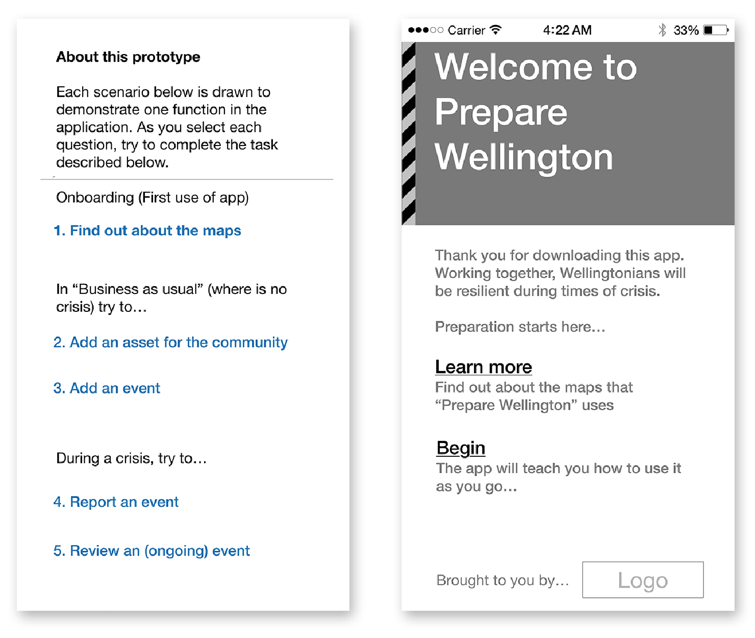
The following two screens feature the tasks that were given to each user when they loaded the prototype. Each of the blue links directed the user tester to the task that they needed to complete. At this point of the proposal, the design research was only interested in subjective and qualitative feedback.
Each of the following sequences represent a different position or new state that is possible to trigger by a user. Each task sequence follows the journey proposed and presented earlier in §6.2 User journeys.
The starting position for all users, the experience prototype listed instructions for each task that the user could attempt (left). The wireframe that illustrated the loading or start page for a user who had opened the page for the first time (right).
The starting position for all users, the experience prototype listed instructions for each task that the user could attempt (left). The wireframe that illustrated the loading or start page for a user who had opened the page for the first time (right).
Onboarding – First use of app
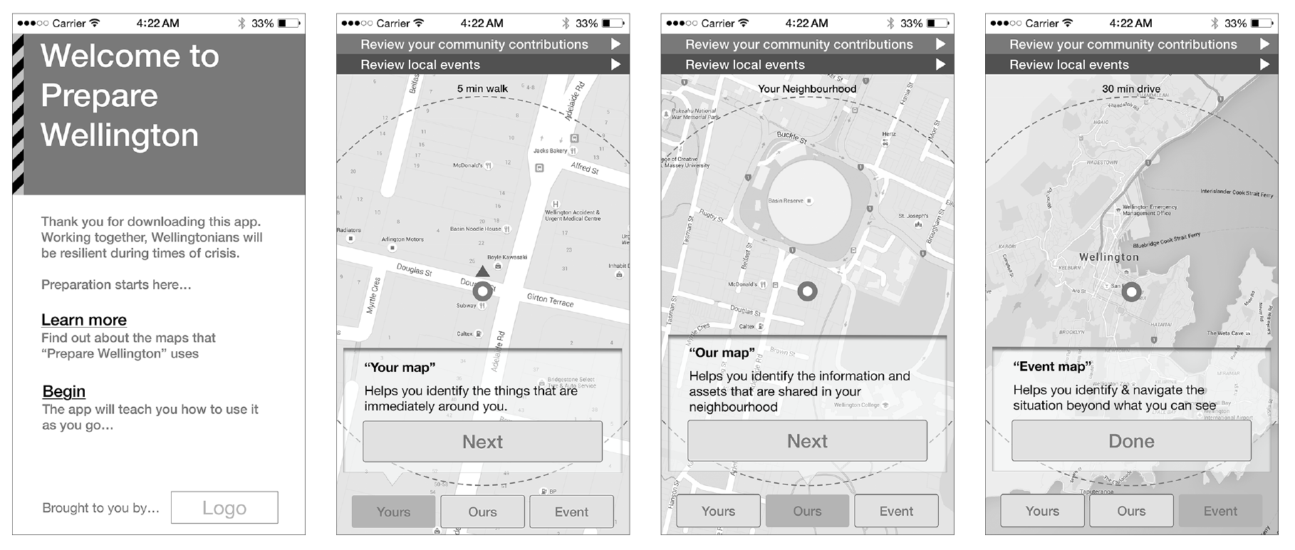
- The loading or start screen that describes the experience for a user who has opened the page for the first time. User selects ‘Begin’
- …and is presented with an explanation of the ‘Your’ map page. User selects ‘Next’ or ‘Ours’…’
- …and is presented with an explanation of the ‘Our’ map page. User selects ‘Next’ or ‘Event’…
- …and is presented with an explanation of the ‘Event’ map page. User selects ‘Done’ or another map view. In BAU the user is taken to the screen in the next section.
Business as usual – Pre crisis
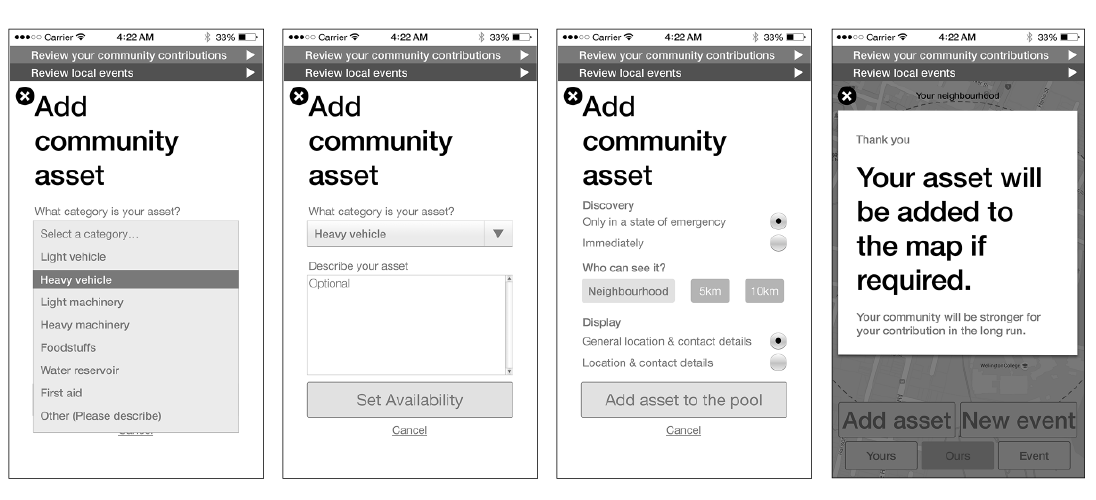
Add community asset

- Initial screen when the user is experiencing BAU. Relative UI Focusses user toward preparation. User selects ‘Contribute’…
- …and is directed to ‘Our map’. Two options are presented: User selects ‘Add asset’
- …‘Add community asset’ allows user to find out more about the purpose of a community asset. User selects ‘I’d like to add something’
- …‘Describe and categorise the community asset’
- …‘Categorise the community asset’
- …‘Describe the community asset’ User selects ‘Set availability’
- …‘Set availability and allowance permissions for community asset’. User selects ‘Add asset to the pool’
- …‘Process conclusion and confirmation.’ User can press the [x] to leave the task.
Business as usual – Pre crisis
Add event
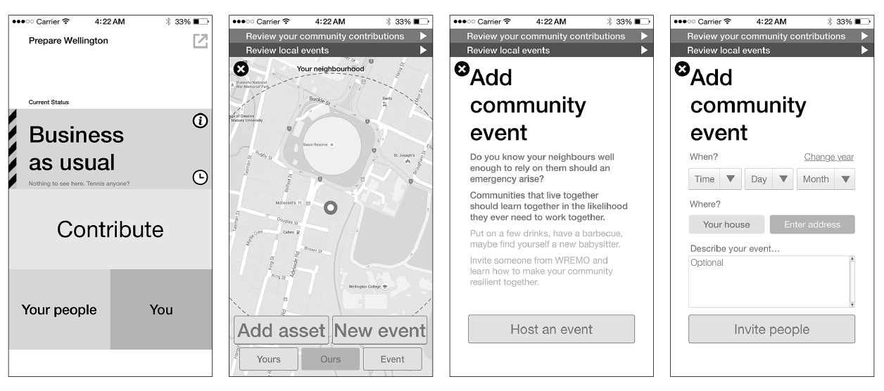
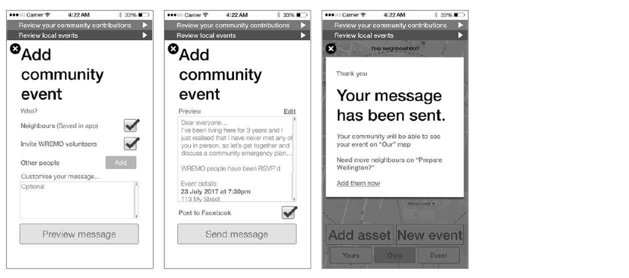
- Initial screen when the user is experiencing BAU. Relative UI focusses user toward preparation. User selects ‘Host an event’
- …and is directed to ‘Our map’. Two options are presented: User selects ‘New event’
- …‘Add community event’ allows user to find out more about the purpose of a community event. User selects ‘Host an event’
- …describe the details around the time of the event including the location. User selects ‘Invite people’
- …Invite people includes details that allow the user to include people in their proximity and WREMO volunteers. User selects ‘Preview message’
- …Options made in the previous steps are assembled into one message preview
- …Process conclusion and confirmation. User can press the [x] to leave the task.3.
Post-crisis – What’s around you?
Report event
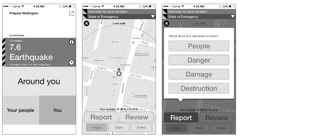
- Initial screen when the user is experiencing a confirmed crisis relative to their location. Relative UI focusses user toward response. User selects ‘Around you’
- …and is directed to ‘Your map’. The information presented is slightly different from the BAU view. Two options are further presented: User selects ‘Report’…
- …and is presented with a form encouraging them to describe an ongoing situation. User selects ‘Danger’…
- …and are asked to describe the type of danger. User selects ‘Fire’…
- …and is presented with an option to enter further information. User selects ‘Send’…
- …and concludes the report with a confirmation screen. User can press the [x] to leave the task.
Post-crisis – What’s around you?
Review event
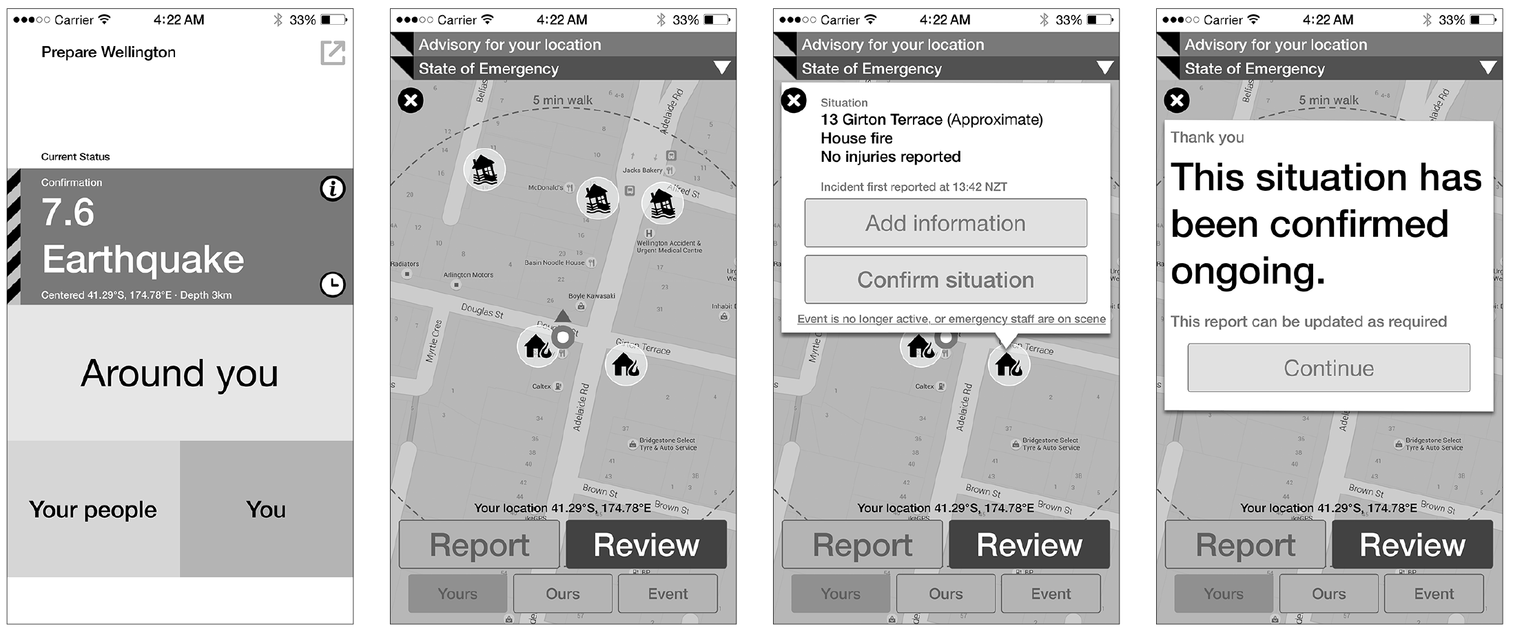
- Initial screen when the user is experiencing a confirmed crisis relative to their location. Relative UI focusses user toward response. User selects ‘Around you’
- … and is directed to ‘Your map’. The information presented is slightly different from the BAU view. If there are active situations around the user, they will be displayed on the map. Two options are further presented. User selects ‘Review’…
- … and a modal overview of the information surrounding the situation and its location is displayed. Two options are made available. User selects ‘Confirm’ situation…
- …and concludes the review with a confirmation screen. User can press ‘Continue’ or the [x] to leave the task.